Photography's Hue Psychology Unveiled
Impact of Colors on Human Behavior in Photography
Colors play a significant role in shaping the emotional landscape of photography, influencing how viewers perceive and connect with images. This article explores how photographers can leverage color psychology to enhance composition and storytelling effectively.
Emotional Associations
Certain colors evoke specific emotional responses based on psychological and cultural contexts:
- Red: Anger, passion, energy, intensity
- Blue, Purple, Indigo: Sadness, calmness, introspection
- Yellow: Happiness, joy, warmth
- Green: Relaxation, harmony, nature-connected calmness
- Gray: Neutrality, balance, professionalism without emotional saturation[1][3][5]
Narrative and Mood Framing
Colors act as narrative elements, framing the story and mood of the photograph—whether it is longing, comfort, distance, or excitement. They guide the viewer’s interpretation almost subconsciously[1][4].
Cultural Context
Color meanings can vary culturally, influencing emotional responses. For example, black often signifies mourning in Western cultures, while white has similar connotations in certain Asian traditions. Understanding cultural color meanings helps avoid unintended interpretations[3].
How Photographers Can Use This Knowledge
- Intentional Color Choice: Deliberately select colors within the frame to evoke intended feelings or highlight thematic elements. For example, using red hues to emphasize passion or urgency, or blues to evoke melancholy or calm.[1][5]
- Environmental Portraiture: When including a subject’s surroundings, the interplay of environmental colors with the subject can deepen storytelling by reflecting personality, mood, or a narrative related to their context[2].
- Balance and Composition: Utilizing color contrasts and harmonies can direct attention to key elements or balance the composition without overwhelming the subject. The right color balance helps maintain focus and emotional clarity[2][5].
- Combining with Other Techniques: Pairing color with lighting, motion blur, and subject expression can intensify emotional impact. For example, motion blur combined with colors associated with anxiety or fear can visually convey those feelings[1].
- Timing and Candid Shots: Capturing fleeting expressions and moments with colors that support the emotion (e.g., warm tones for joy) enhances authenticity and viewer connection[1].
In summary, photographers enhance emotional resonance and storytelling by understanding and thoughtfully applying color psychology—using color to communicate mood, guide viewer responses, and support the narrative embedded within the photograph[1][2][3][5].
The psychology of color studies how colors determine and influence human behavior. The Pantone Color Institute is a specialist organization that researches and approves specific color meanings. Using color psychology in photography can help make better choices in terms of framing, camera settings, and post-processing. Much of colors' meaning is based on learning or culturally determined. Color saturation determines the viewer's reaction to an image and may change the regular emotion associated with a particular color.
References: [1] The Pantone Color Institute. (n.d.). Color psychology. Retrieved from https://www.pantone.com/color-psychology [2] Koller, U. (2017). The psychology of color in photography. Retrieved from https://petapixel.com/2017/08/21/psychology-color-photography/ [3] Smithsonian American Art Museum. (n.d.). Color. Retrieved from https://americanart.si.edu/learn/treasures/color [4] TEDx Talks. (2015). The psychology of color in art and design. Retrieved from https://www.ted.com/talks/van_winkle_brown_the_psychology_of_color_in_art_and_design [5] Wong, C. (2020). How to use color psychology in your photography. Retrieved from https://digital-photography-school.com/color-psychology-photography/
- Photographers can plan their compositions using the impact of colors on human behavior, drawing on color psychology for a more effective storytelling experience.
- A skilled photographer can purposefully incorporate fashion-and-beauty elements, integrating colors that match the desired mood or lifestyle, thereby increasing visual appeal.
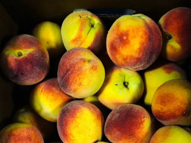
- For food-and-drink photography, colors can evoke feelings of hunger or comfort, making the dish more compelling and tempting to viewers.
- A home-and-garden photographer might use earthy tones to highlight a sense of tranquility and nature-connected calmness, projecting an ambiance of personal growth and emotional well-being.
- Relationships between people can be emphasized through deliberate color choices, using warm and inviting hues to suggest affection or cold, muted tones for distance or tension.
- Education-and-self-development photography can benefit from the judicious use of colors, conveying ideas of growth, learning, and self-actualization through the images’ emotional associations.


